
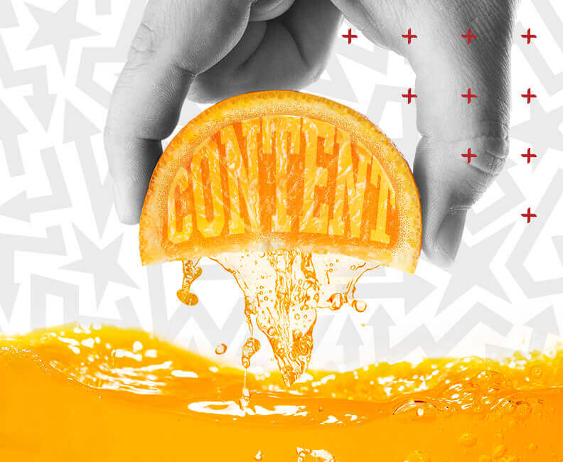
Is the juice worth the squeeze? Maximize your content ROI
Struggling to get real results from your content? Learn how to align brand, audience and promotion to maximize your return on investment.
Content creation can feel like a never-ending cycle. There’s always something you could be doing. Each asset? Another drop in the bucket. In a world with countless stories, reels, blogs, landing pages and more, it can leave your head spinning as to which tactics are worth your time.
Over the last decade, I’ve seen countless content strategies in practice. Whether it’s mastering long-tail SEO, building out robust e-books or going full throttle with “unhinged” social strategies, brands are doing it all.
The key to success is the upfront brand and strategy work before the content is created.
Here are some tips to ensure the content you’re creating delivers real value – making the juice of content creation worth the squeeze.
Step one: consider your audience and brand first
Admittedly, this is a big step.
Before you start creating content, get clear on who you’re creating it for. A strong message starts with a strong understanding of your audience: who they are, what they care about and what motivates them to engage. If your audience segmentation is outdated, vague or overly broad, even the most well-crafted content can miss the mark.
Once you know who you’re talking to, then it’s time to take a hard look at your brand. If you haven’t audited your brand recently, now’s the time. Consistently nailing your message, across formats, channels and touchpoints, requires a clear sense of your brand’s voice, style and market position. Whether your goal is brand awareness, traffic or leads, alignment between brand and audience is what makes content actually work.
Step two: find your bait
Imagine fishing without a worm on your hook – that’s what a lot of branded content is doing today. In a world of AI slop and fried attention spans, it’s critical to give your audience some type of offer in exchange for their attention. It could be something like a coupon, insider tips or a limited-time deal. Sometimes, it’s simply a good old laugh (humor is a great way to gain brand awareness!)
The point is: you don’t want to create content that is self-serving. You need to find a way to create value and content that benefits your audience. Ask yourself: what’s in it for them?
Step three: nail the asset, back it with promo
By being strategic before you start content creation, you’re increasing the likelihood of creating a valuable piece of content that drives results. But now…it’s time to see what sticks.
Let’s say you’re rolling out a new promotion – and it’s the best offer your brand has created to date. There’s more to it than following your brand standards and creating something that stands out. Great content needs a great promotional plan to give it teeth and make it stick in the marketplace.
With Google constantly moving the goalposts on search results, and Meta being overtly pay-to-play, you can’t rely on the quality of your brand work alone to get it noticed. That’s where a robust promotion plan comes in. Even if you have a limited budget, there are opportunities to get scrappy with your dollars to ensure the right eyes are seeing the content you’ve painstakingly created.
By focusing on brand strategy first, you will ensure your content garners results – no matter the asset or medium. Need a little help with any of these steps, or just want to talk marketing? We’re always game.