Thinking
How packaging design affects choices
You’re hosting a party, and you’re looking for a vodka to get everyone in the right spirit. You’re standing in the liquor store aisle, and you are presented with many different options. Different brands using different colors, photos and fonts along with a variety of other design elements to stand out on that shelf.
Maybe you have a strong personal preference or maybe you’re open and looking for what stands out.
What stands out
A study from the National Academies of Science, Engineering and Medicine found that with multiple stimuli presented when selecting products, the visual of a package helps instantly convey meaning without written information. This includes the consistent placement of visual cues such as a logo, contrast with other elements on the package and a prominent symbol that attracts attention.
At MindFire, we use a wide variety of design elements to help positively affect our clients’ target audiences – to essentially make our clients stand out. We’re more interested in showing you what we mean, so we’ll use the work the MindFire design team did for our friends at Mississippi River Distilling Company as an example. They needed to refresh their products and they trusted our design team to redesign their bottles to create a uniform look across their product line.
Branding comes first
You can’t create an effective design if you don’t have your company’s brand in place. Before we light the design fires, we conduct our research phase to seriously determine the company’s brand, its target audience and areas of opportunity.
From there, the design team steps in to communicate the brand through visuals. Stop for a moment and think of your favorite brand and how they use consistent colors, images and a logo to let you know a product or service is part of their brand.
Where we started
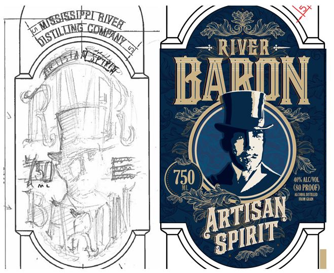
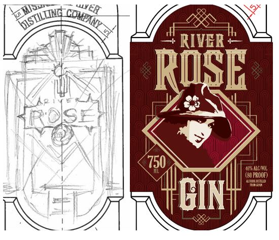
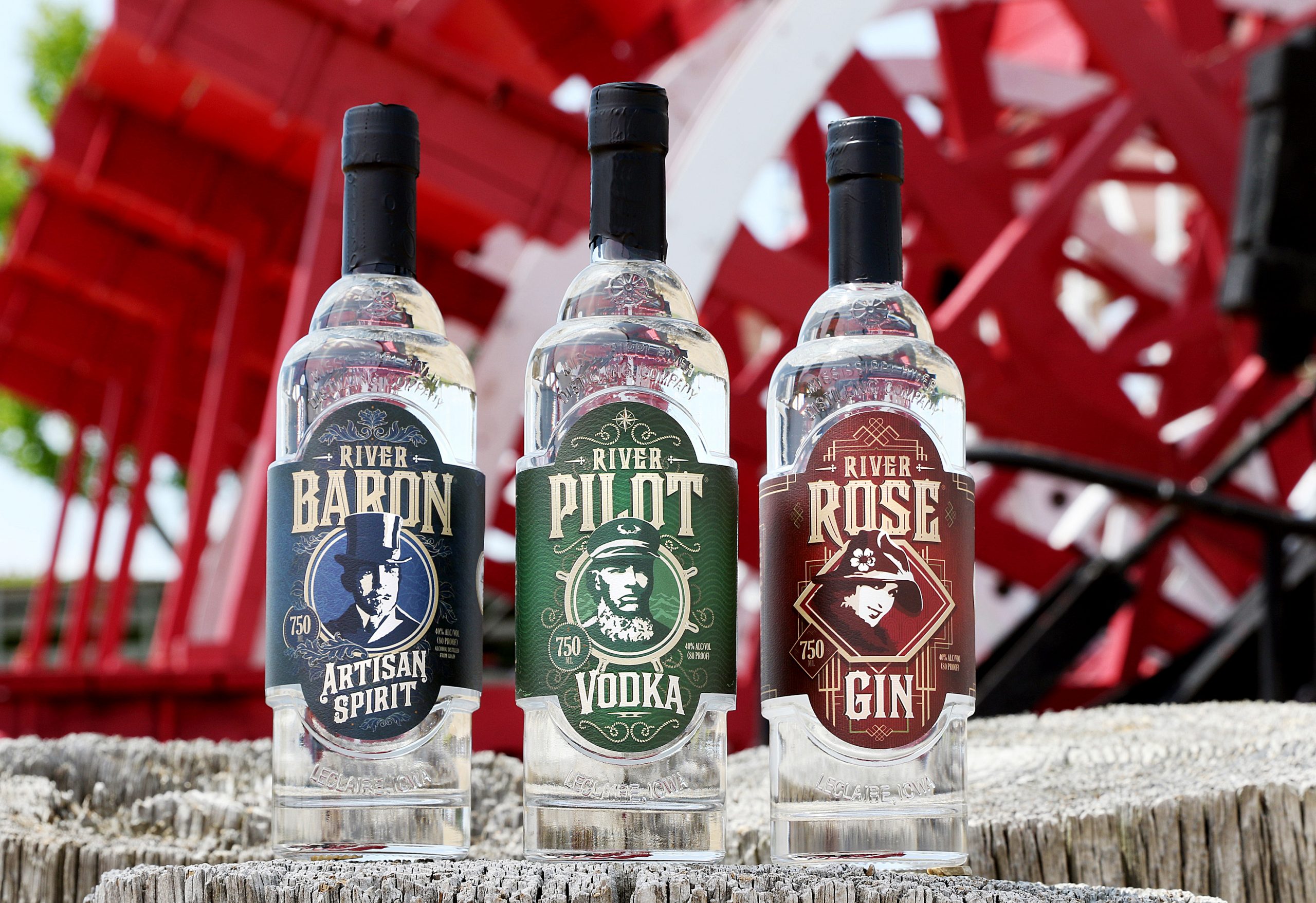
We first established the characters of the River Baron, River Rose and River Pilot.
The original River Baron character and label came first and naturally used a blue (river) color palette. Then the Rose character and label were developed and red was chosen as a primary counterpart to the blue and a play off “Rose”. Finally, River Pilot was added and green was chosen to extend the color palette. The bottle designs had traditional, stylized character illustrations and vintage-inspired fonts but overall were clean, bold and modern.
Reconsidering the packaging
When you think of a branded design, your first thought probably goes to the label. But the package itself plays a large role in your choice. Mississippi River Distilling Company decided to refresh their bottle design to keep it uniform across their brand, so we spent lots of time researching what the bottle itself should look like.
Our goal – concept and design a bottle that would be bartenders’ preference including making it easy to grab on the speed rail with the right neck length and a good weight. Beyond being a fit for bartenders, we also wanted the bottle to display better on retail shelves with one distinctive, clear style so that all of the 750 ml products were aligned visually.
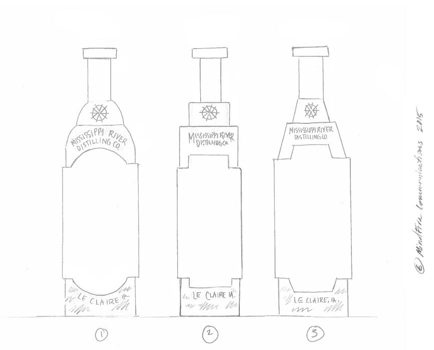
Having already established what sets the Mississippi River Distilling Company apart from its competitors, we set out to tie the bottle design to its location on the Mississippi. We took inspiration from moorings on peers, rope, ships’ wheels… basically anything tangible that was associated with the river. We also researched old bottle designs and turn-of-the-century time period artwork because that fits with Le Claire’s antiquing brand, and Mississippi River Distilling Company’s local ties are a large part of its story.
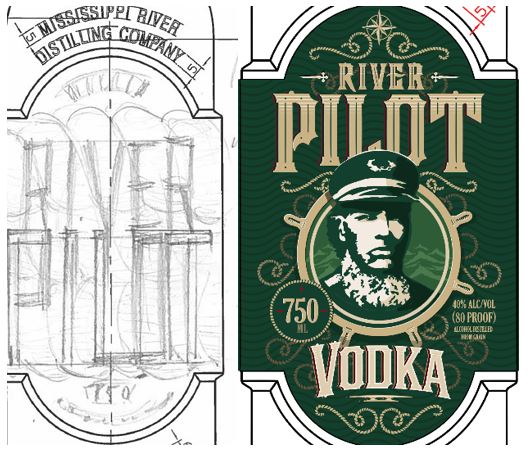
We landed on a more traditional shape. Below is a sketch of the initial bottle designs.
What’s the story?
With shape and color in place, it was time to focus on the visual story we were trying to tell.
For the bottle design, we wanted to maintain the established characters, but we wanted to add more historical depth and richness with Victorian flourishes, period Art Deco line work, nautical embellishments, etc. as well as deeper tones of the existing blues, reds and greens. The inspiration for each design came from studying each character, their respective roles in society and iconic elements that represented them as well as the artistic styles of their time period.
We also worked in a neutral tan/gold color from the corporate Mississippi River Distilling Company ship’s wheel that added richness and helped tie the brand together across all labels. The Cody Road series also incorporates historic Le Claire images for authenticity and texture.
Up first was the River Baron. He was an aristocrat, so we wanted to show a mature gentleman whose style and tastes would have steered toward the Victorian era of style. Patterns and textures were an indicative element of Victorian design. It was so prolific, in fact, the trend was to not only wallpaper their walls in these intricate patterns, but also their ceilings. In the design, the patterns were incorporated subtly in the background while also being a prominent element in the foreground.
Next was River Rose, whose character is described as a 1920s flapper. She inspired a design that represented the time period of the roaring 20s. Art Deco was a modern style that touted excellent craftsmanship and high-end materials. Geometric patterns were a hallmark of this French-based art movement beginning just before WWI and ending when WWII started.
Last was the River Pilot. He was more of a common man who lived his life on the Mississippi River navigating the currents, rocks and channels; therefore, nautical elements like a ship’s wheel, rope and compass were utilized to create this design. These items were common in this individual’s everyday life. To continue the precedence set by the Baron, a subtle abstract texture of waves was created for the background.
As you can see, each story was carefully considered and then the design of each label worked to tell that story in a unique, compelling way.
Have you thought about the story your brand is telling through its visuals? Or are you interested in considering how to refresh the look of your products? If you’re interested in working with MindFire on your next design project, drop us a line.