
Thinking
Your copy is only as good as your designer
You can have the best headline in the universe, but if the design and visual execution of the message isn’t awesome, it will fall flat. Design and copy must always work together to create an intentional and effective brand touchpoint.
Here’s why:
Words are defined and finite.
When you sit down to work on messaging or headlines for a campaign, the fact of the matter is that there are only so many routes you can explore. You only have 26 letters in the alphabet to rearrange over and over again. Hopefully you can do so in such a way that it resonates and conjures an emotional reaction from the audience. That’s where borrowed interest, idioms, plays on words and puns come in handy.
A great example of the limited nature of copywriting is within the automotive industry. The name of a car can play a pivotal role in whether a particular model takes off. Imagine if Ford chose the name “Pony” instead of “Mustang.”
However, there are limiting challenges with naming a vehicle, like the insane trademarks between manufacturers, and the versatility of the word on a global scale. That’s why some manufacturers have turned to the world of made-up words to try and forge feeling and meaning without the confines of language. This is how we end up with names like Volkswagen’s Tiguan. It’s named by combining a tiger and an iguana. What?
Because of the limited nature of language, design is forced to pick up the slack and make something truly unique and remarkable. The look and feel of a Mustang is more important than the name itself but the name does set the tone. The name evokes the desired emotion, but the design is what brings it to life.
Design brings new life to trite (and sometimes unavoidable) marketing messages.
With goal-oriented marketing, it’s typical that your copy has a strategic goal to communicate. Designers can reinvent messages with a look or feel that grabs attention, giving a platform to a message that might have been tuned out if it weren’t eye catching.
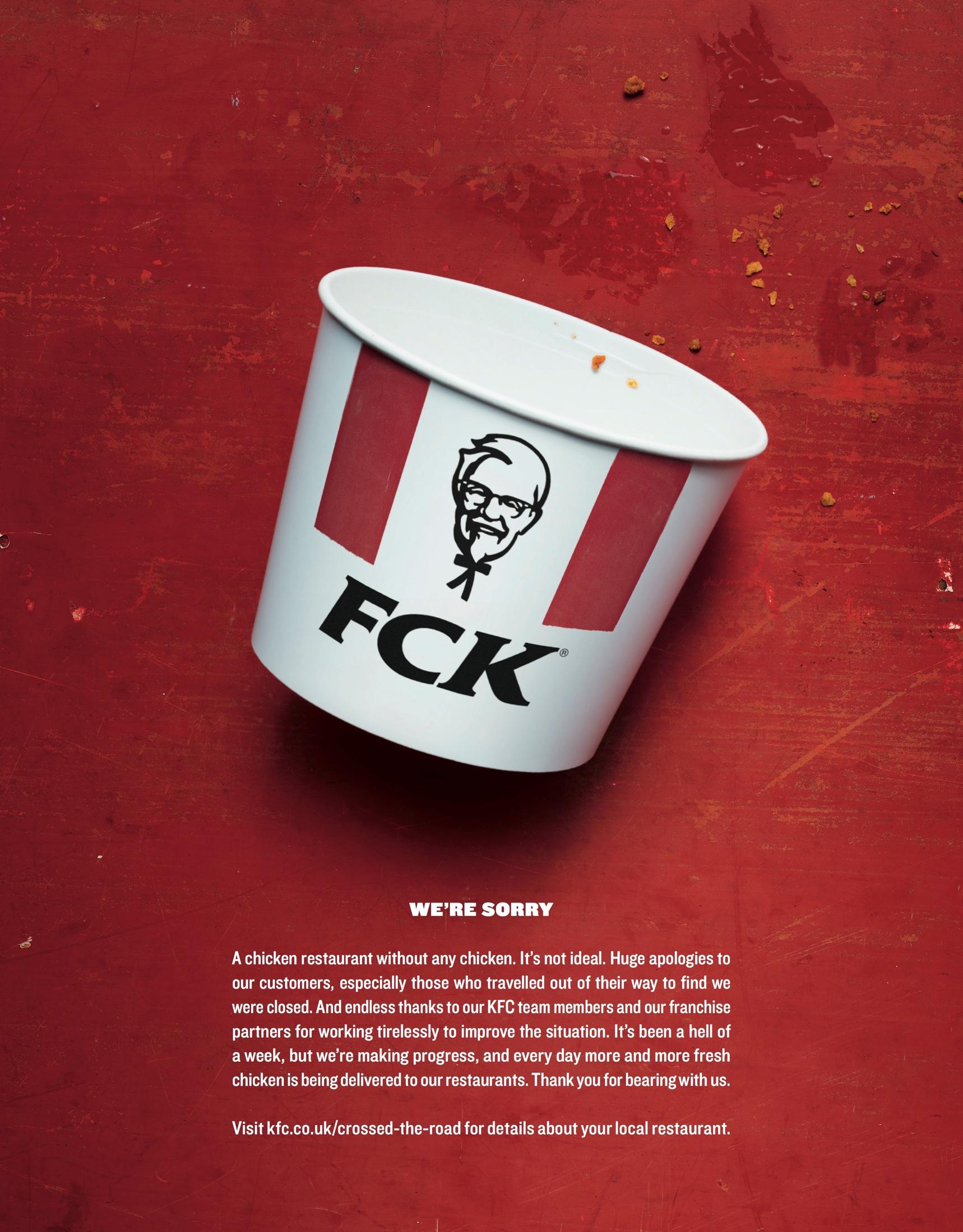
One example of a run-of-the-mill and unavoidable marketing message that a company may encounter is an apology. This ad by KFC uses a bold design to bring attention and humor to a message that isn’t very fun otherwise.
Humans absorb visuals much quicker.
Design has the beautiful ability of making messaging not only digestible, but irresistible. You can look at an image and have an emotional reaction much faster than you can read a paragraph of copy to arrive at the same place.
In fact, sometimes design is so powerful that you don’t need to use words at all. This Lego ad is a perfect example of that:
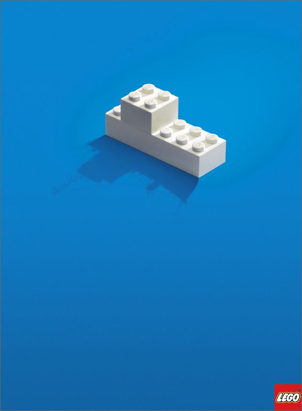
Without any words, the viewer still understands the intended message – that you can create whatever you want with Legos, or it’s up to your imagination to build anything you desire. Because this ad does not have specific words to read, it leaves some interpretation of the message up to the viewer, which is also the overall meaning of the ad – Legos can be whatever you want them to be.
The aesthetics of your message can change its meaning.
Aligning the vision and feeling of the message is critical. The way in which your words are presented visually make them more, or less, impactful. This ad by The Salvation Army is a great example of the copy and design working together to create an impactful message:
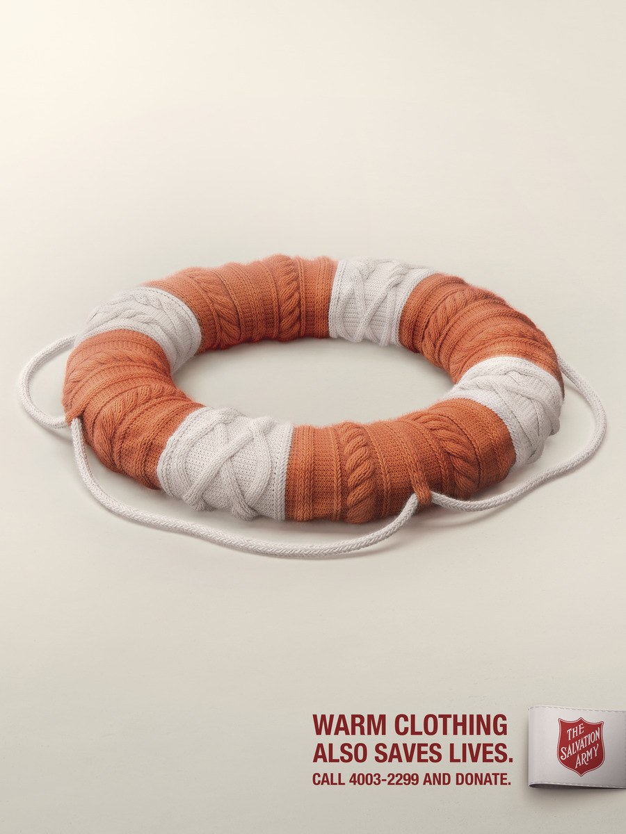
In this example, both the message and design would not be as meaningful without the other. The copy needs the design to make the ad more engaging and interesting, and the design needs the copy so the message is clear: warm clothing saves lives.
In closing…
What it really boils down to is a “teamwork makes the dream work” situation. You can’t be a one-man-band. What I’ve seen in the creative field is that there are principles, formulas and foundations that lead to acceptable design and writing. But remarkable creative…the kind that really resonates and moves the needle, is produced by teams of individuals who put the brand first and tirelessly fight monotony.